
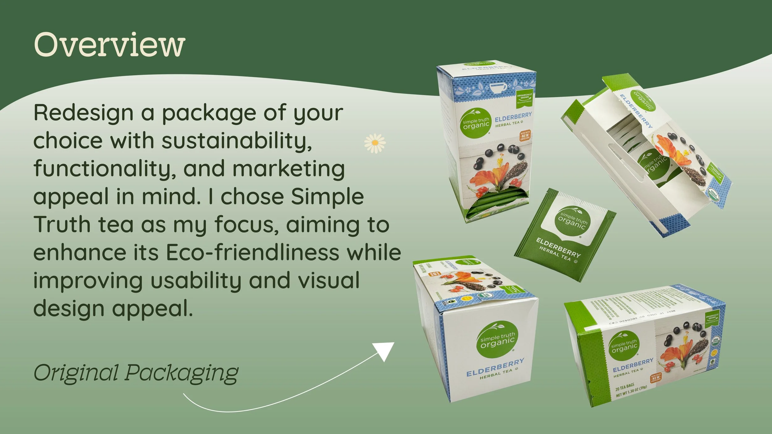
Simple Truth Tea Box Packaging
I redesigned the Simple Truth chamomile tea packaging to improve sustainability, functionality, and shelf appeal while modernizing the brand’s visual identity.
Project Scope
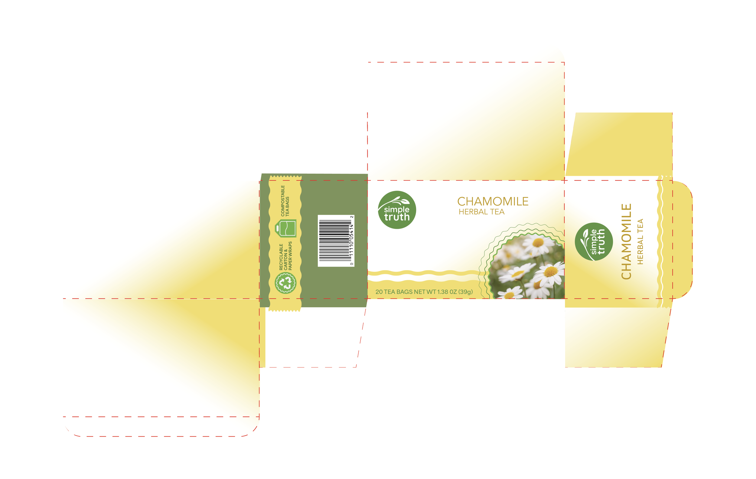
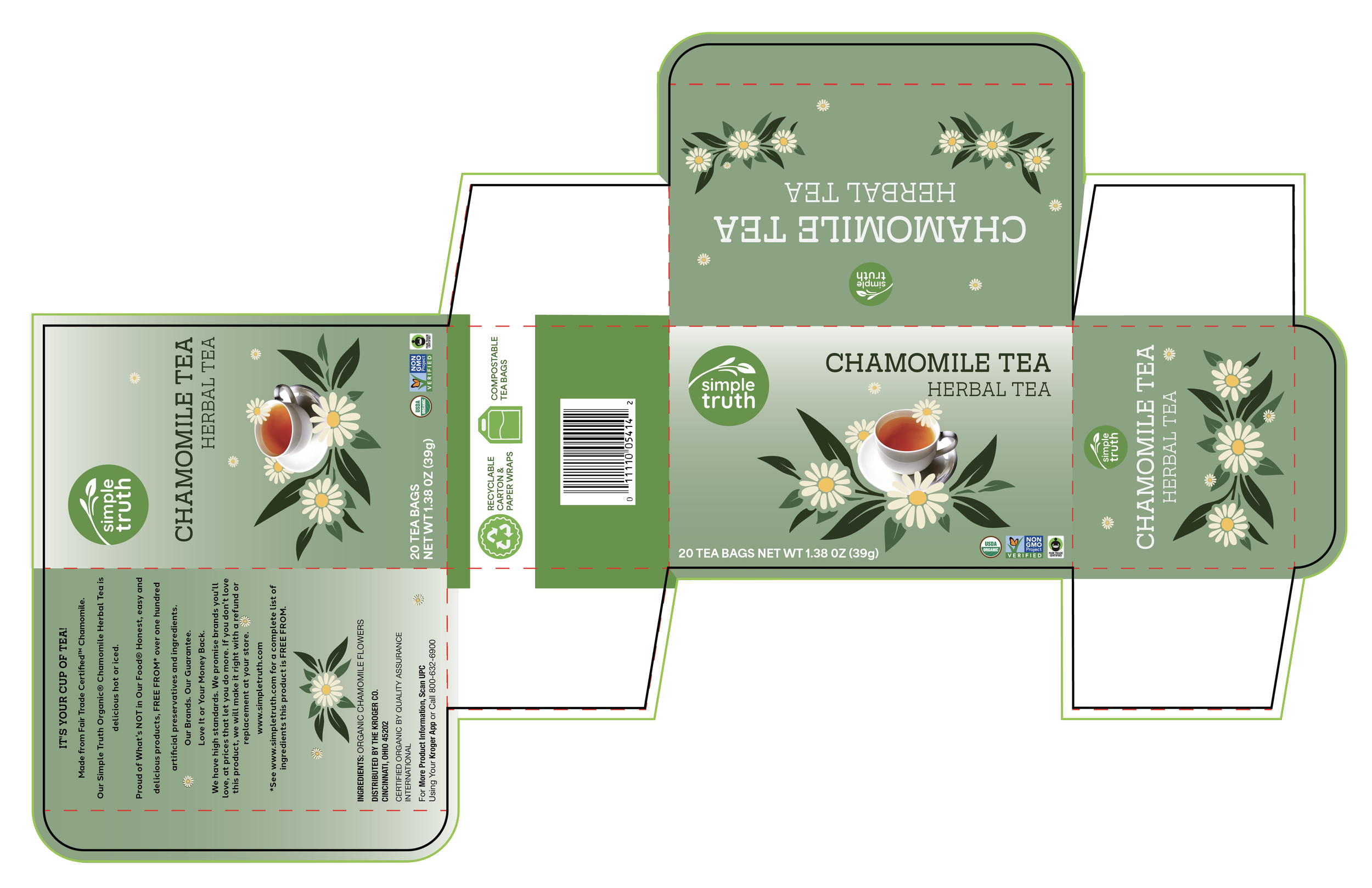
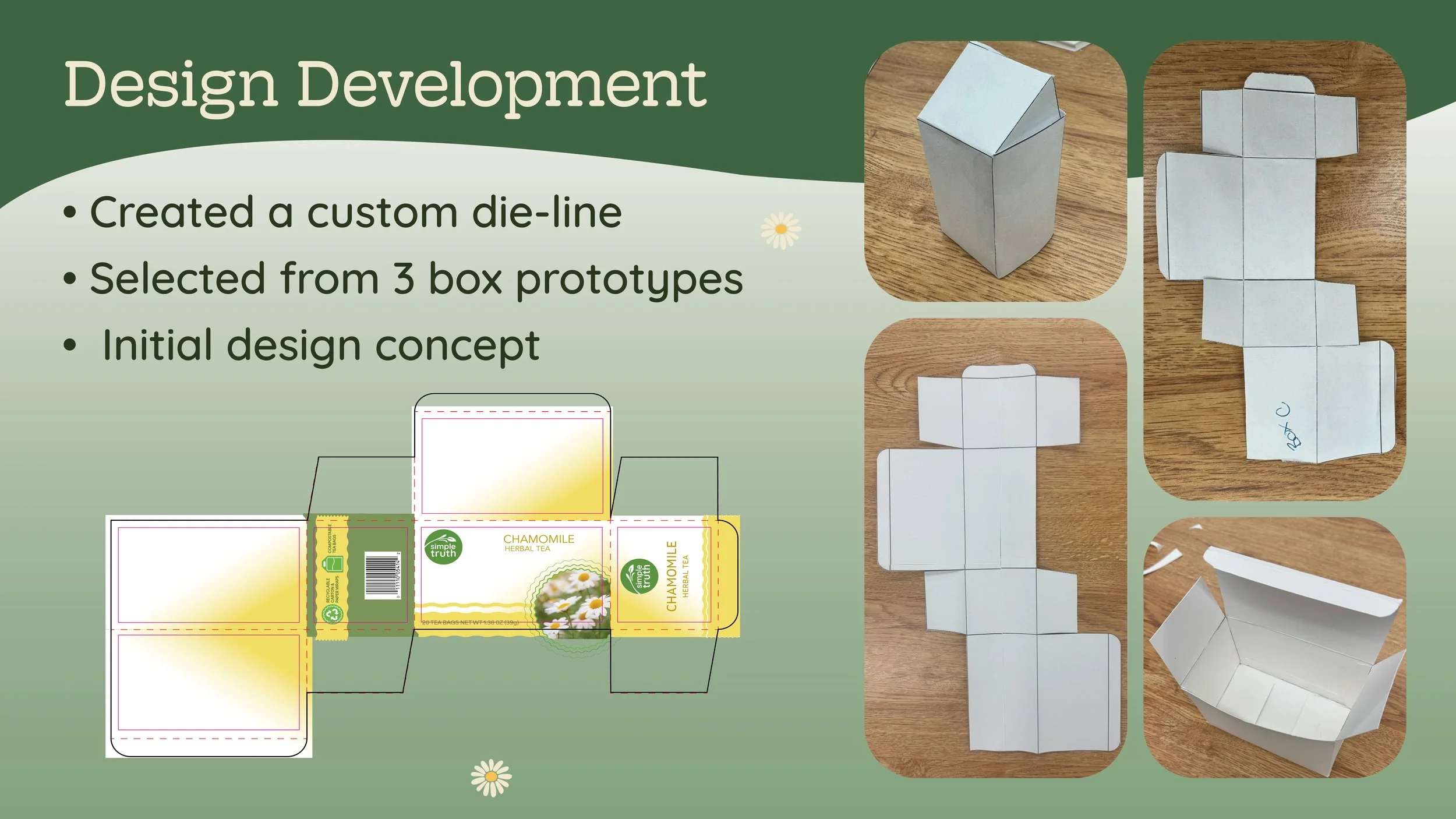
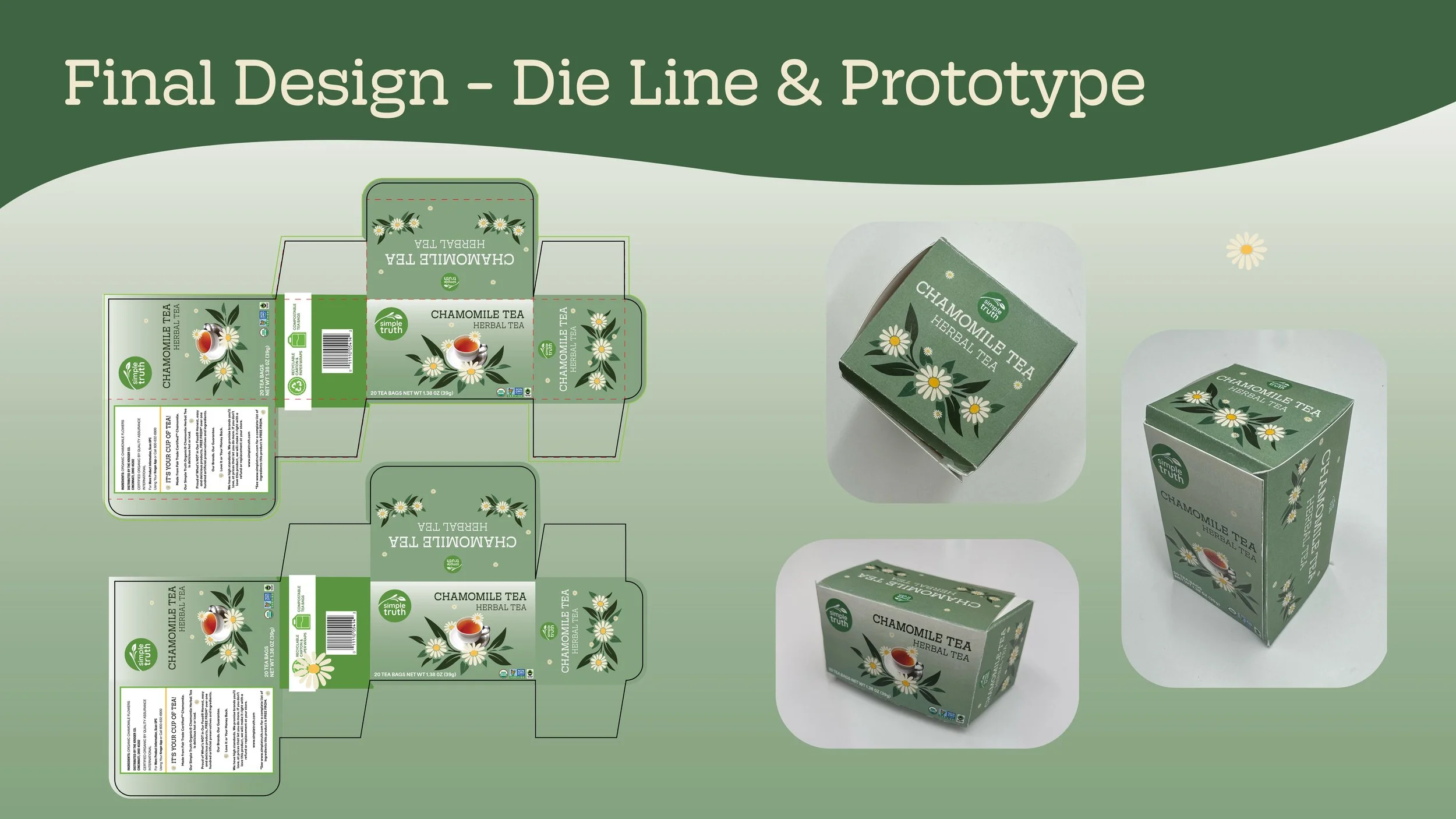
Custom Die-Line
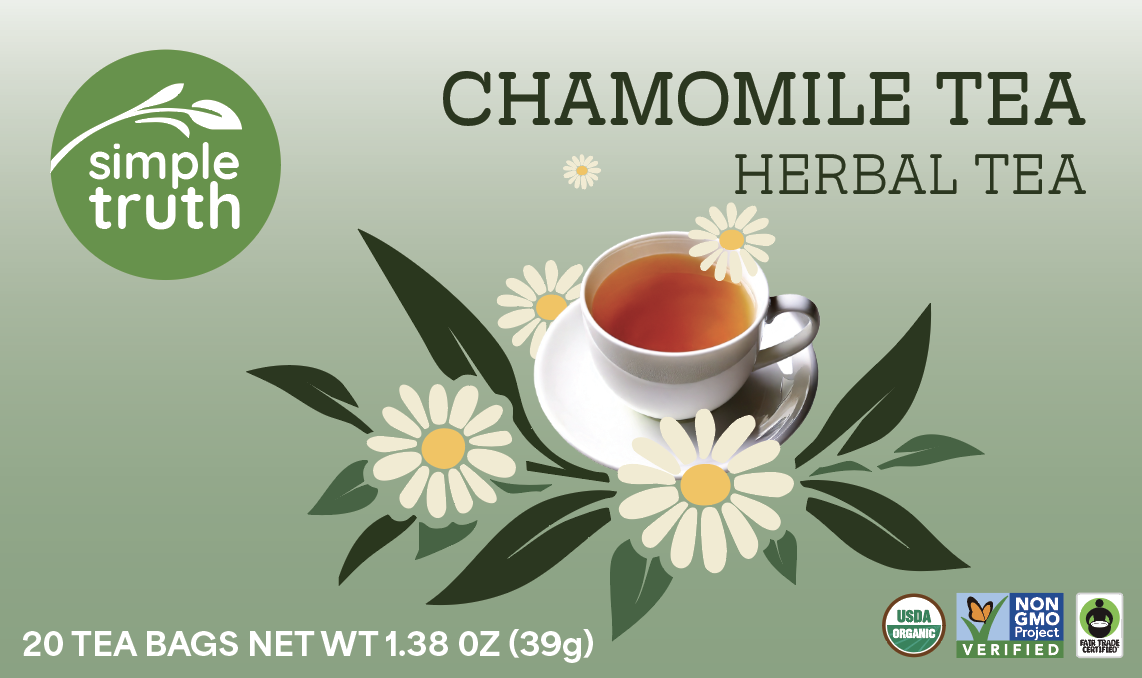
Logo Refinement
Color Palette
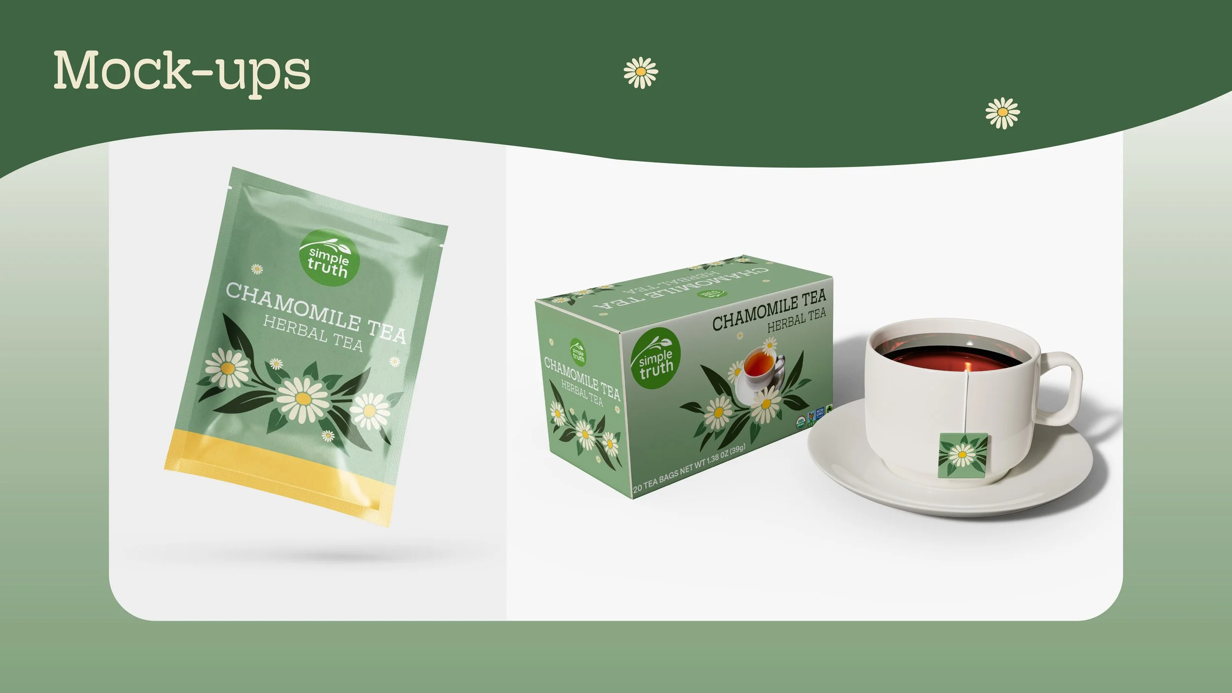
Packaging Mockups
Sustainability Improvements
The Challenge
The original packaging relied on plastic wrap, had an outdated look, and presented accessibility issues with its logo. The design needed to feel more eco-conscious, visually engaging, and easier to use.
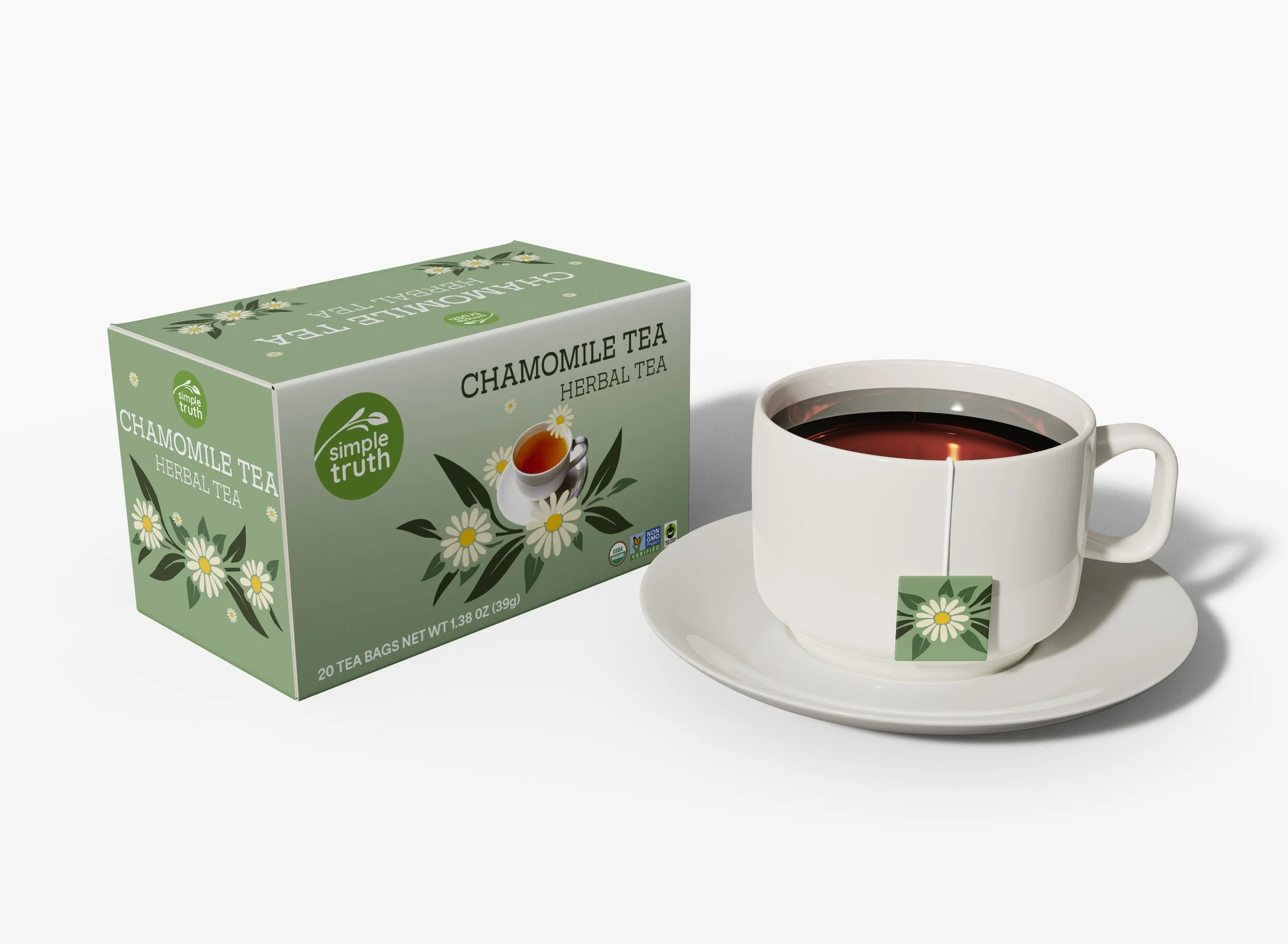
Before

The Solution
I created a fully recyclable tea box and proposed compostable tea bags. Using a soft green color palette, refined typography, and delicate floral illustrations, I enhanced the brand’s organic, calming feel. I developed a custom die-line and selected from three prototypes to refine the final structure and design.
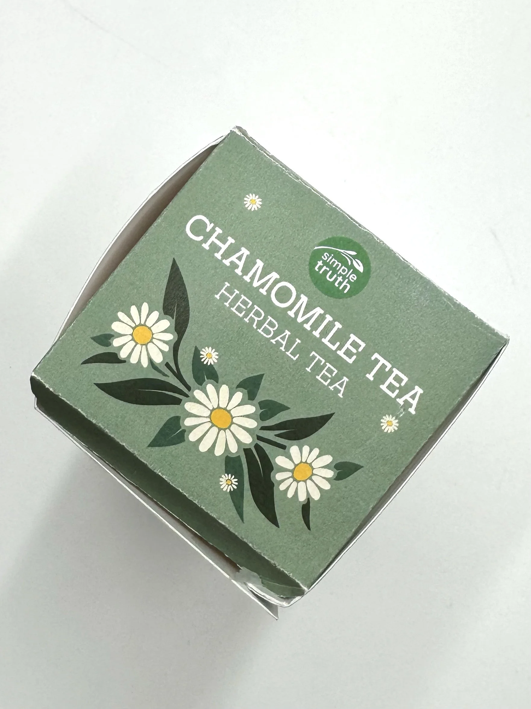
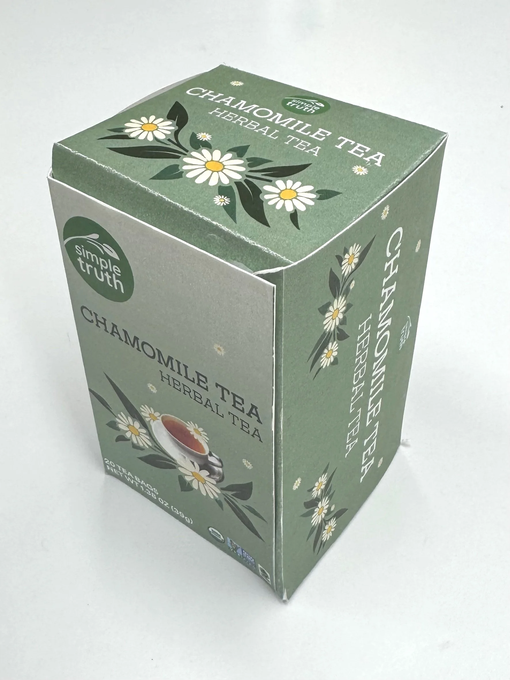
After
The Process
Research and early design exploration revealed the need to move beyond the original aesthetic. After iterating with prototypes and mood boards, I established a clean, modern system using Quicksand and Hoss Round Slab fonts for improved readability and brand cohesion.
Concept Development
The Outcome
The final design successfully elevates Simple Truth’s branding with a fresh, eco-friendly packaging system that balances minimalist aesthetics with marketing appeal. The box is fully recyclable, accessible, and visually inviting — staying true to the brand’s organic roots.

Prototype
Project Proposal Presentation


Visualizing The Brand
Mockups showing real-world applications.


I redesigned Simple Truth Tea’s packaging to improve sustainability, usability, and visual appeal. The final tea box is fully recyclable, clean, and approachable, better reflecting the brand’s organic mission.
Project Summary