
Launch Coffee Shop
Project Scope
Logo Redesign
Color Pallete
Mockups
Launch Coffee is a vibrant Colorado coffee shop known for serving espresso, food, and cocktails in a welcoming, scenic setting. I selected this business for a logo redesign project to better reflect their lively, dual-purpose atmosphere — a cozy coffee spot by day and a spirited gathering place by night.
The Challenge
The original Launch Coffee logo was functional but lacked strong visual identity. It didn’t reflect the energy or unique transition between coffeehouse and casusal cocktail bar, and it missed opportunities for richer visual storytelling.
Before

The Solution
I redesigned the logo by combining a martini glass and a coffee cup into one flowing form, symbolizing connection. Sunrise-inspired circles add warmth, movement, and balance, bringing energy to the brand.
After

The Process
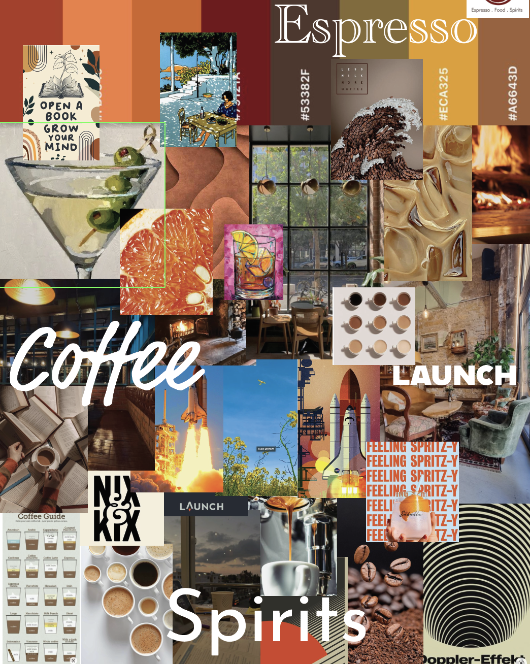
My design process is meticulous and intentional. I begin by thoroughly understanding the brand through research and a creative brief. From there, I collect inspiration and build a mood board to guide the visual direction. I then move into brainstorming through sketching, exploring different ideas on paper before transitioning to digital design, where I refine and develop the final concepts.
Sketches
My design process always begins with pen and paper. I explore ideas through quick sketches, letting concepts flow freely before refining them digitally. Early sketching helped me visualize the energy and movement I wanted to capture in the final logo.
Concept Development
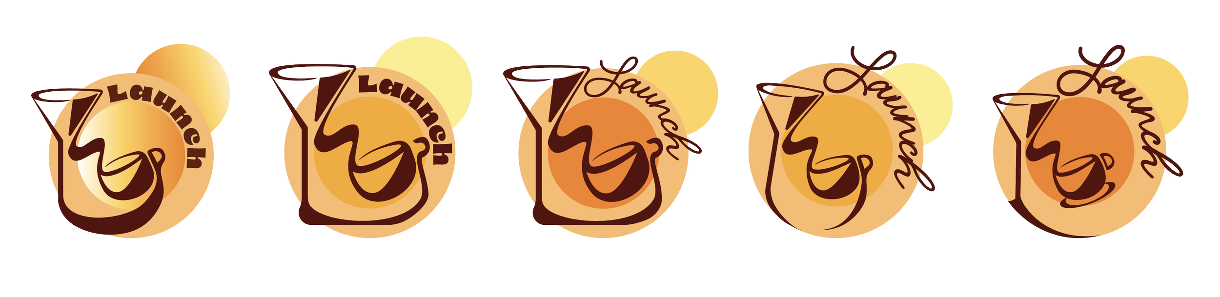
Through exploring multiple color combinations, tints, and gradients, I refined the logo into a simple four-color scheme that feels fun, lively, and fresh. Feedback played a major role in this process— one round of critique challenged me to see the design from new perspectives, allowing me to strengthen the flow, refine the forms, and bring the concept fully to life.
Visualizing The Brand
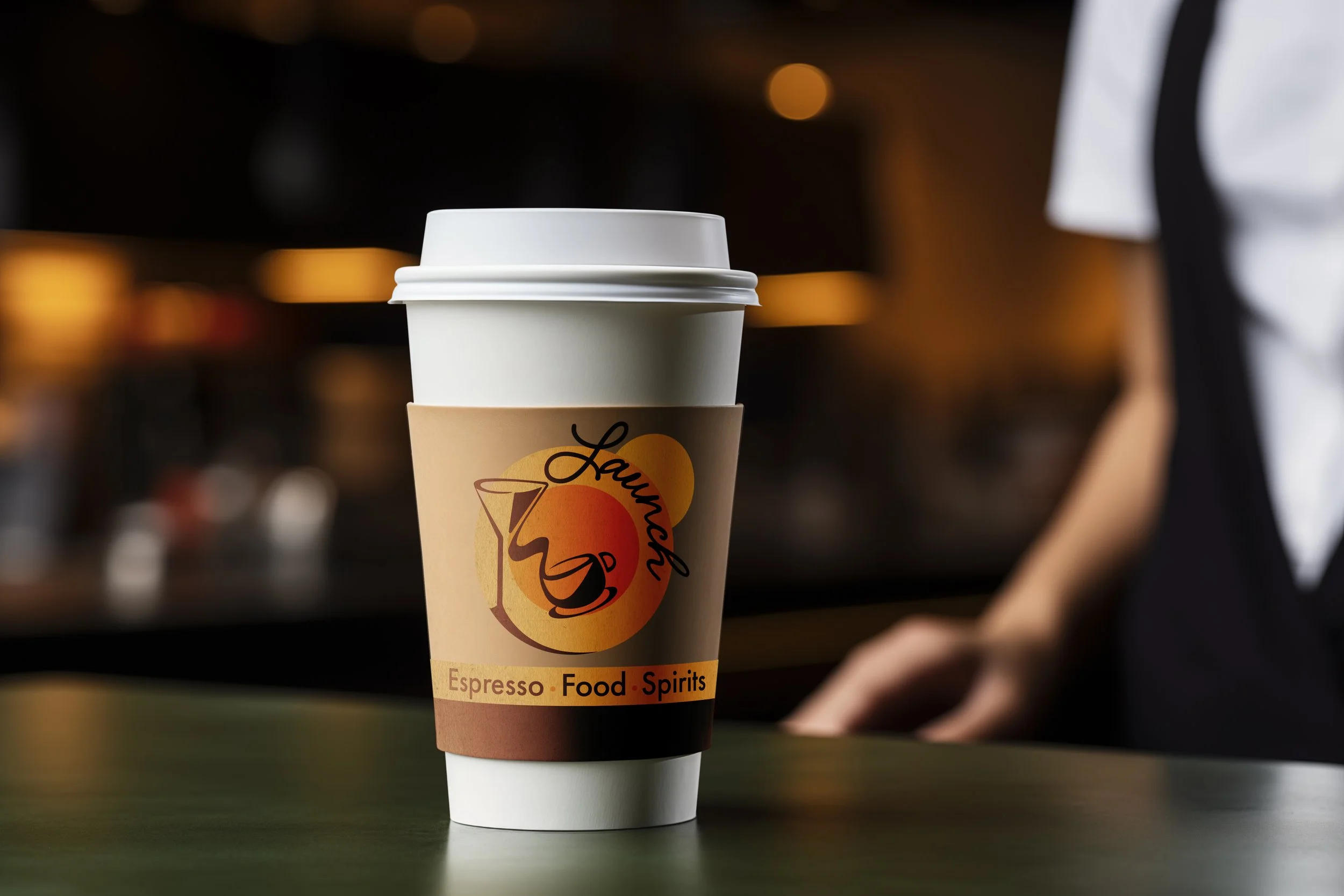
Mockups showing real-world applications.


This project strengthened my ability to translate brand atmosphere into visual identity. I learned how to build layered symbolism into a clean design, refine concepts through feedback, and create branding that feels meaningful both digitally and in real-world applications.
Project Summary