Les Baronnes Winery
Project Scope
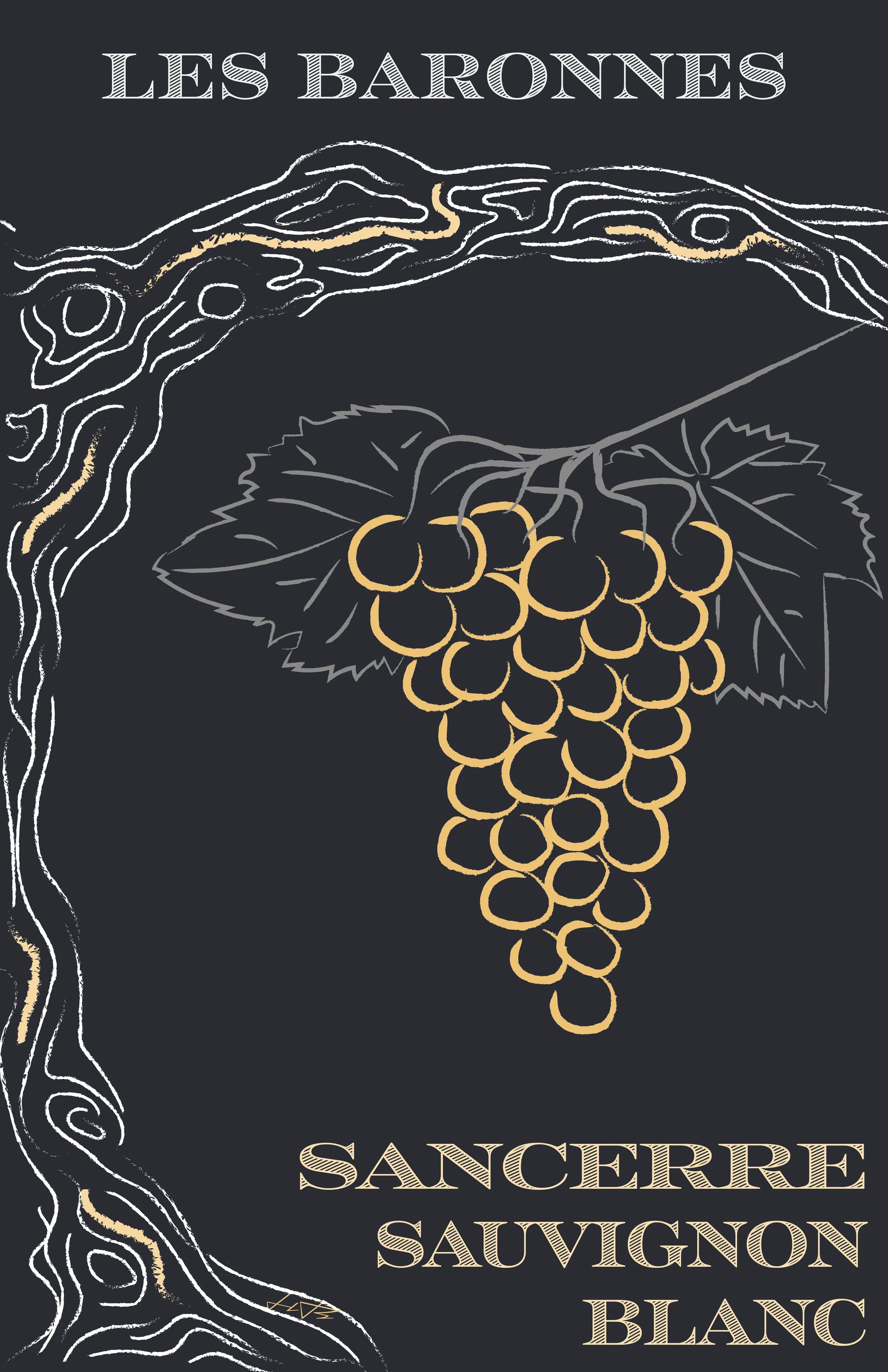
Wine Label Redesign
Color Pallete
Illustration Design
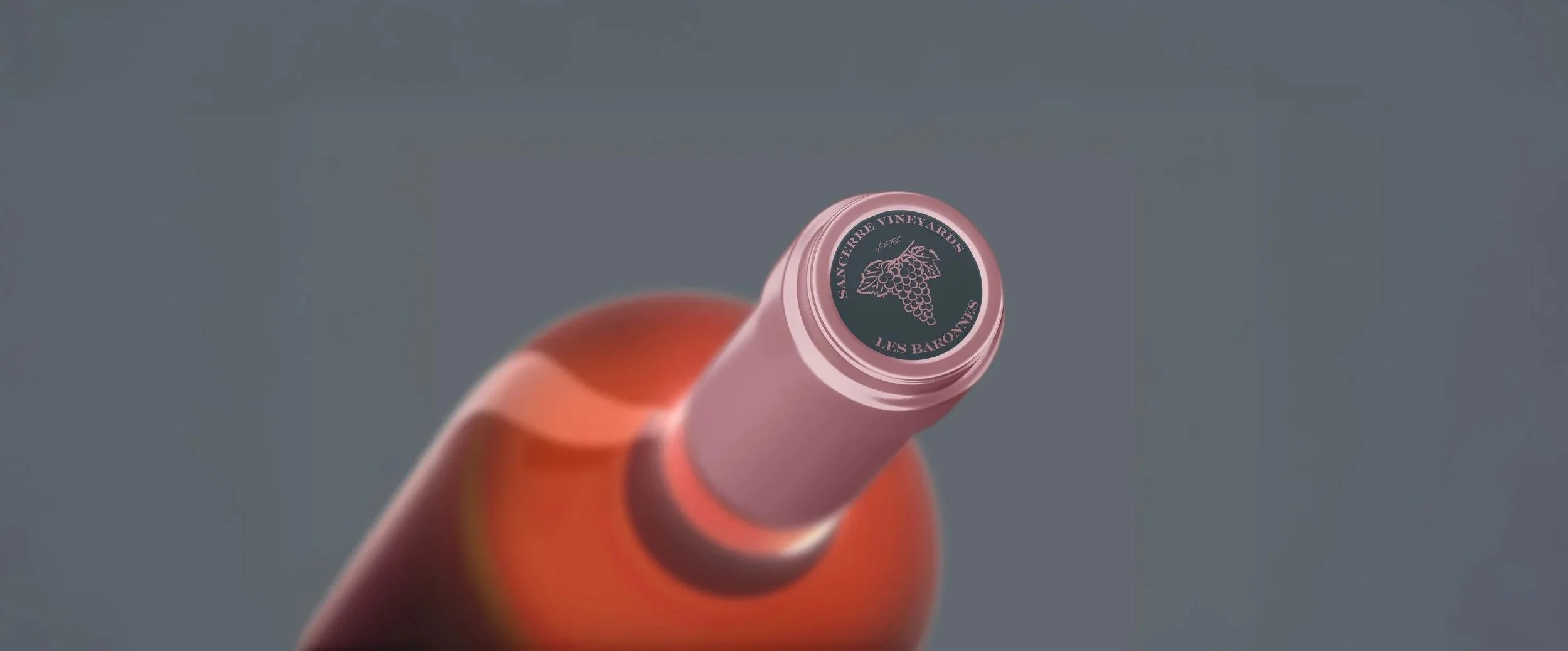
Wine Bottle Mockups
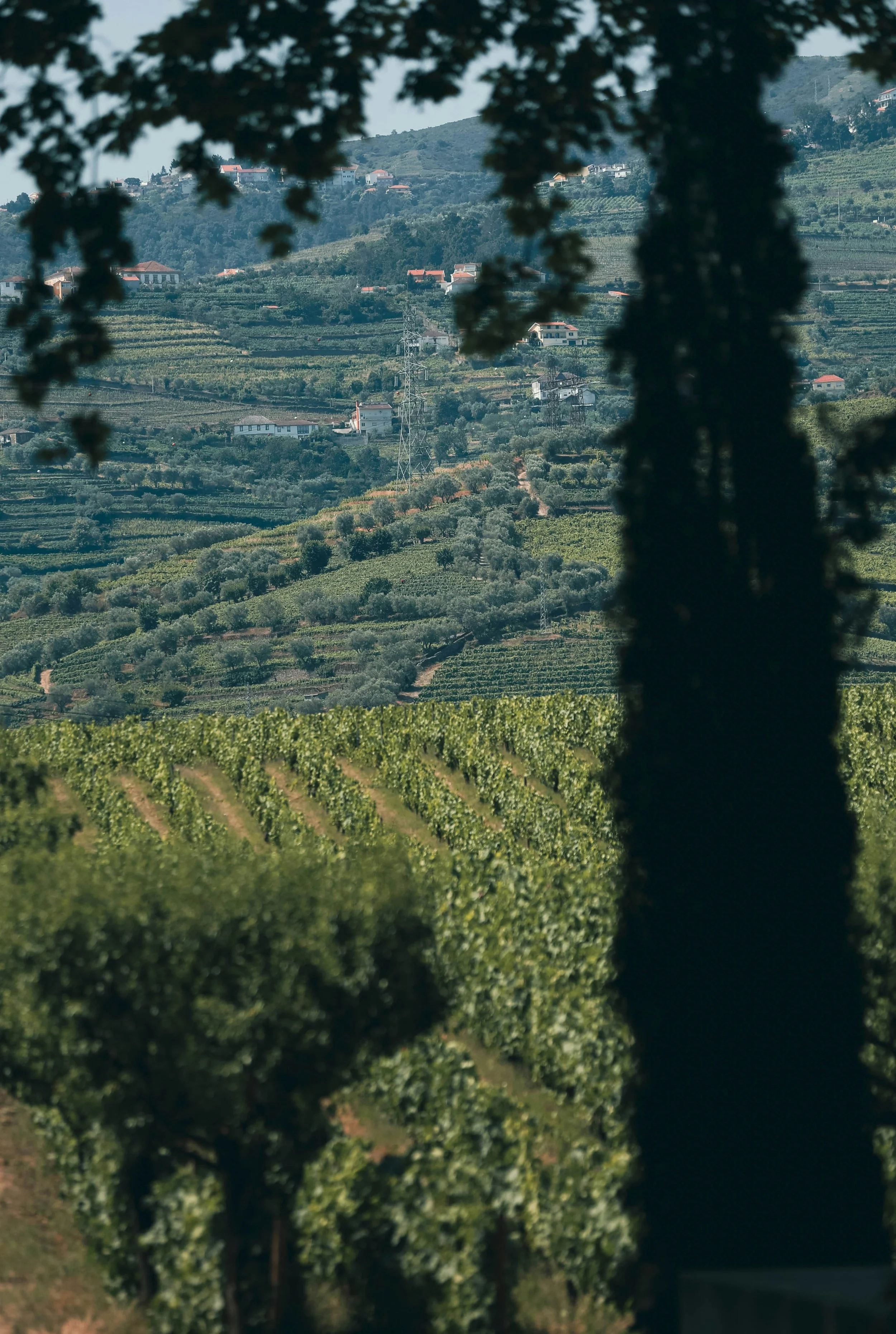
Les Baronnes is a historic French winery located in the Loire Valley, known for its mineral-rich soil and refined wines. I rebranded their wine label to better capture the vineyard’s authenticity, heritage, and premium quality.
The Challenge
The original branding lacked a strong visual connection to the vineyard’s unique story. The goal was to create a design that felt natural and sophisticated while visually reflecting the richness of the land.
Before

The Solution
I developed a hand-drawn, chalk-style grape illustration to symbolize the vineyard’s mineral-rich soil. Paired with clean typography and a rich, dark color palette, the design balances authenticity with elegance. Each wine variety is subtly distinguished through color accents that match the wine type.
After
The Process
Starting with research into the region and traditional vineyard aesthetics, I explored different illustration styles before finalizing a chalk-like texture to reflect the earthy character. The label was designed to feel timeless, blending artisanal elements with a modern, premium look.
Visualizing The Brand
Mockups showing real-world applications.


I rebranded Les Baronnes Sancerre Winery to reflect its mineral-rich soil and heritage through chalk-style illustrations and refined typography. The final design feels authentic, elegant, and true to the vineyard’s story.
Project Summary
